Savr Recipes is a new startup that aims to simplify the process of following recipes for home cooks, and make it easier for them to cook great meals. However, the company was receiving negative reviews about recipes that involved many steps or advanced techniques, leading to disappointment from users who found the instructions unclear. To address this problem, I was brought on to lead a design sprint and quickly test possible solutions.
As the lead designer for the GV design sprint, I was responsible for synthesizing user research, reviewing user interviews and feedback, coming up with a solution to improve the overall experience of the app, creating new UIs and conducting usability testing.
After reviewing the research and personas, I found that users preferred recipes to be as simplified as possible, and also wanted to know exactly what ingredients, appliances, and pots and pans would be needed to complete the recipe at the very beginning. Using this information, I used a 5-day GV Design Sprint to create a better user experience, focusing on how users interact with the app once they have found the recipe they want to follow.
Design Constraints:
On the first day, I reviewed personas, user interview notes, and recordings to get a better understanding of user expectations and pain points. Using that information, I created a user journey map, which illustrates the touch points a user would have with the app, as well as their emotions and needs at each stage. I also identified key areas of the user experience that were causing friction, such as the lack of visibility of ingredients and equipment needed for a recipe at the beginning.

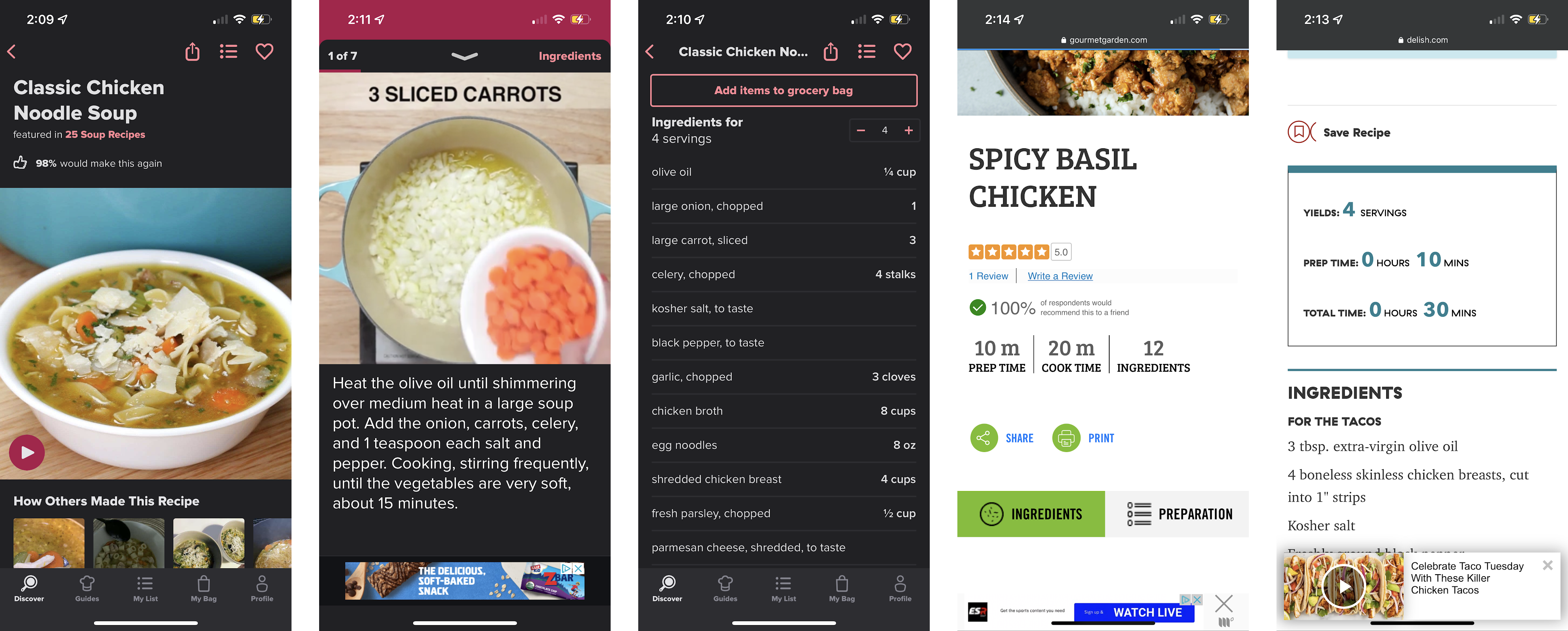
I completed a solo version of lightning demos, looking at solutions that competitors had produced to solve a problem similar to what I was trying to solve. After browsing a few apps, I really loved the way Tasty laid out their app. They included a short but informative cooking video to go along with every recipe. There was an ingredients list right under the video and before the instructions. There was also a “Step-by-step” feature where it would break down the recipe into steps and include a short clip and instructions on how to complete the step. Delish.com would show how long it takes to prep the ingredients and also the total time it takes to complete the recipe. I also liked how Gourmetgarden.com displayed the total amount of ingredients needed to make the recipe. This research helped me understand what other apps were currently doing in the market to solve a similar problem.

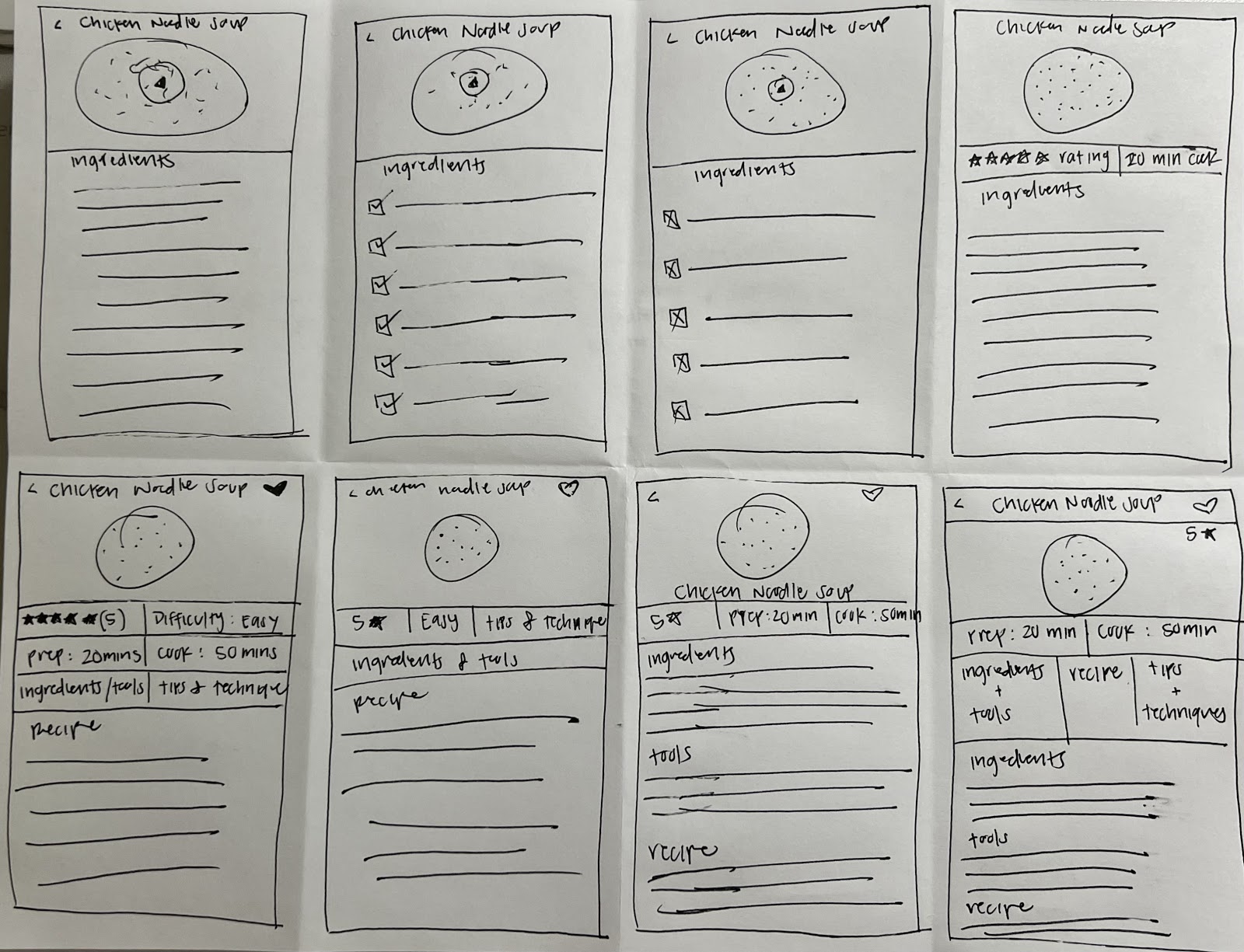
Using Google Venture’s Crazy 8’s method, I created 8 sketches of the most critical page in 8 minutes. I chose this screen as the most critical screen for my app because it’s the screen that users would initially see after selecting the recipe they would like to make. It has the most important details such as a video, ratings, difficulty, ingredients list, and the recipe itself. This quick sketching exercise helped me generate a lot of ideas in a short amount of time and gave me a rough understanding of what the critical screen would look like.

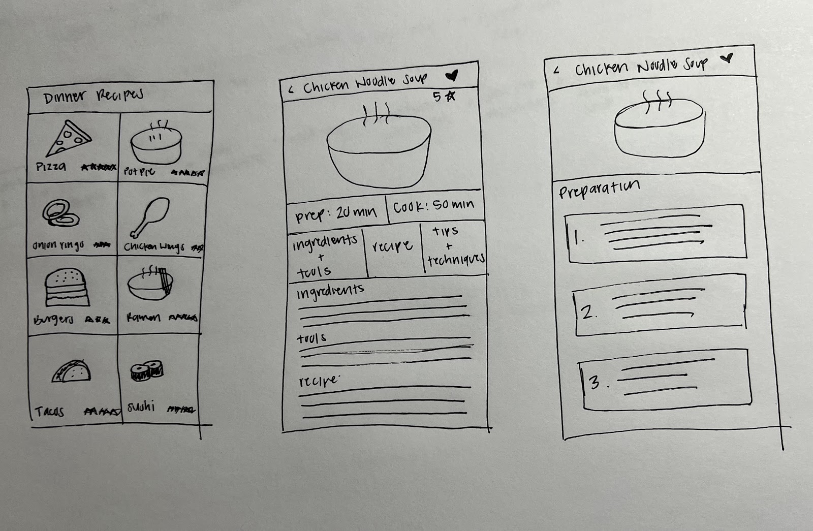
I created a three-panel board of the screen that comes before the critical screen, the critical screen itself, and the screen that comes after the critical screen. The first screen is an overview of all the recipes to select from. The critical screen is a more detailed page of a specific recipe and the last screen shows the full recipe. This solution sketch helped me visualize how the different screens would flow and helped me refine the design further.

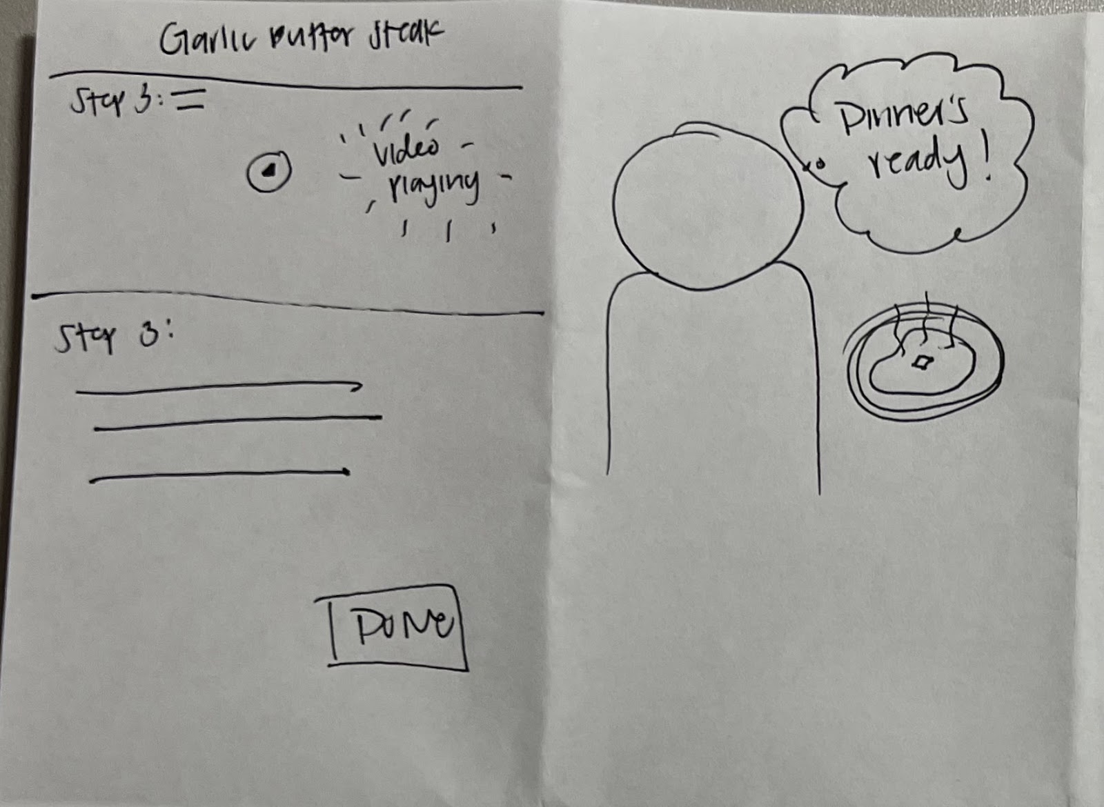
Day 3 consisted of creating a panel storyboard that showed all the interactions and screens the user will need to have to complete a recipe and have dinner ready! I started off with the user in the app store searching for a “cooking recipe” app to download. After downloading the app, the user proceeds to search for a recipe and then follows through with the preparations until they complete all the steps and dinner is ready. Using the user journey map and pain points identified, I created a user flow that addresses these issues by providing users with an ingredients and equipment list upfront, as well as incorporating videos and step-by-step instructions. This user flow was then used to create a panel storyboard which illustrates the key screens and interactions the user will have with the app to achieve the task of cooking a recipe. In the design process I applied design principles like scannability and visual hierarchy, making sure that important information like ingredients, equipment and video tutorial is prominently placed and easy to scan, this way the user can quickly find what they need in the app and avoid frustration and disappointment.


I used the panel storyboards I made on day 3 to create some UI’s of the most important pages of the application in Figma. I used this design tool to ensure that the layouts were consistent and user-friendly. I also used Marvel to create a high-fidelity prototype of the solution for user testing on day 5. The prototype was designed to be interactive, allowing users to navigate through the different screens and interact with the different elements of the interface.
As part of the UI design, I paid attention to the principle of affordance, which refers to how the design of an object suggests its function. For example, the use of color, size, and shape were used to indicate which elements of the app are interactive and which are not. I also applied the principle of hierarchy, which refers to the arrangement of elements on a page in order of importance. In this way, the most important information such as the video, ratings, difficulty, ingredients list, and the recipe itself, were placed prominently on the screen and in a clear and easy-to-read format.
During this phase, I also focused on the principle of user-centered design, which is a design approach that prioritizes the needs and goals of the user over those of the designer or the business. I did this by creating user flows that show the various steps that a user would take to complete a recipe and have dinner ready. I then incorporated those flows into the design of the prototype. In this way, I was able to create a solution that was tailored to the specific needs of the users.
For user testing, I selected five participants who enjoyed cooking at home and asked them to use the application from selecting a recipe and reviewing the ingredients and techniques to completing the cooking process. The prototype was tested to ensure that the navigation was intuitive and the content was well-organized, and easy to understand. At the end of each test, I asked these follow-up questions:
User Feedback
The feedback from the users was overwhelmingly positive.
User Suggestions
In conclusion, the design sprint was a successful way to quickly test and iterate on potential solutions to the problem of unclear recipe instructions. The simplified steps and detailed ingredient and equipment list were well received by participants, and the suggestions for further improvements will be taken into consideration for future development of the Savr Recipes app. Overall, the focus on understanding and addressing the user needs was crucial for designing a better user experience for Savr Recipe mobile app.