

The client is a SaaS company that provides solutions for the film production industry. They wanted to improve the user experience across their website to align with their recent rebranding. The goal was to implement a new UI kit and redesign their existing screens to match the new look and feel of their landing page.
The client's main issue was that the existing screens beyond the landing page did not coincide with their rebrand. They wanted our team to use a UI kit that they had purchased and redesign their existing screens to implement the new look and feel of their website landing page. The company had previously conducted research on how to make the Budget Grid more functional, and had completed user journeys, affinity maps, and user interviews which we used for our project.
As Project Manager/Designer for this project, I controlled the process of improving the user experience across the website by managing the client relationship from an initial discovery process, through solution design and delivery, ensuring that deliverables were high-quality, optimally solved the client’s problems, and were delivered on time.
Our team met with the client to understand their needs and goals for the project. The client had recently undergone a rebranding, which included a new logo and brand colors, and had revamped their landing page. However, their main issue was that the existing screens beyond the landing page did not align with the new rebrand.
Our initial task was to understand the scope of the project and the client's specific requirements. The client provided us with a UI kit that they had purchased and asked us to redesign their existing screens to match the new look and feel of their website landing page.
To begin, we conducted a discovery process to gather information about the client's target audience, business goals, and pain points. We used the research that had been conducted by the previous team, including user journeys, affinity maps, and user interviews, to gain a deeper understanding of the user needs and how they interacted with the current website.
With this information, we were able to create a plan to improve the overall user experience across the website and align it with the client's rebranding. This included creating a cohesive design direction and implementing new features that would enhance the user's experience.
In Phase II, we focused on narrowing down a design direction that would align with the client's rebranding and improve the overall user experience.
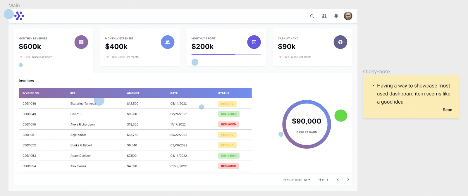
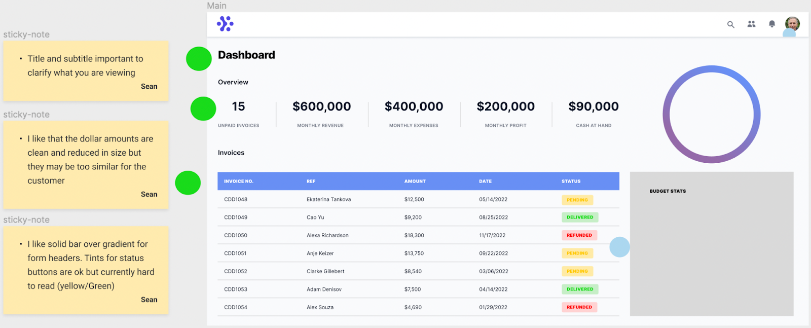
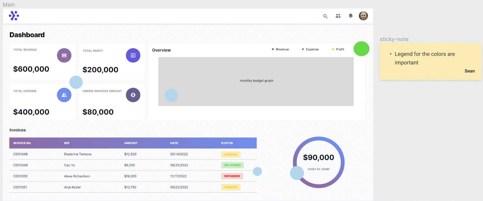
Initially, the client did not provide us with specific brand attributes that they wanted the site to portray, so we used this as an opportunity to present them with some options. We each came up with a design for the Dashboard and conducted design critiques to analyze the designs and provide constructive feedback on whether they were in line with the client's desired direction.

We used design tools such as dots and sticky notes to indicate the elements we liked from each design and provided explanations for why we liked those elements. This helped us to identify common design elements that could be combined to create a cohesive design.
After the initial critiques, we sent the designs over to the client for his thoughts and feedback. He mentioned that due to time constraints, we would not be able to add new features as that would require additional research and testing. However, he liked the look and feel of my designs and provided us with brand attributes such as modern, free, clear, happy, and minimalistic. We used these brand attributes to guide our design decisions moving forward.
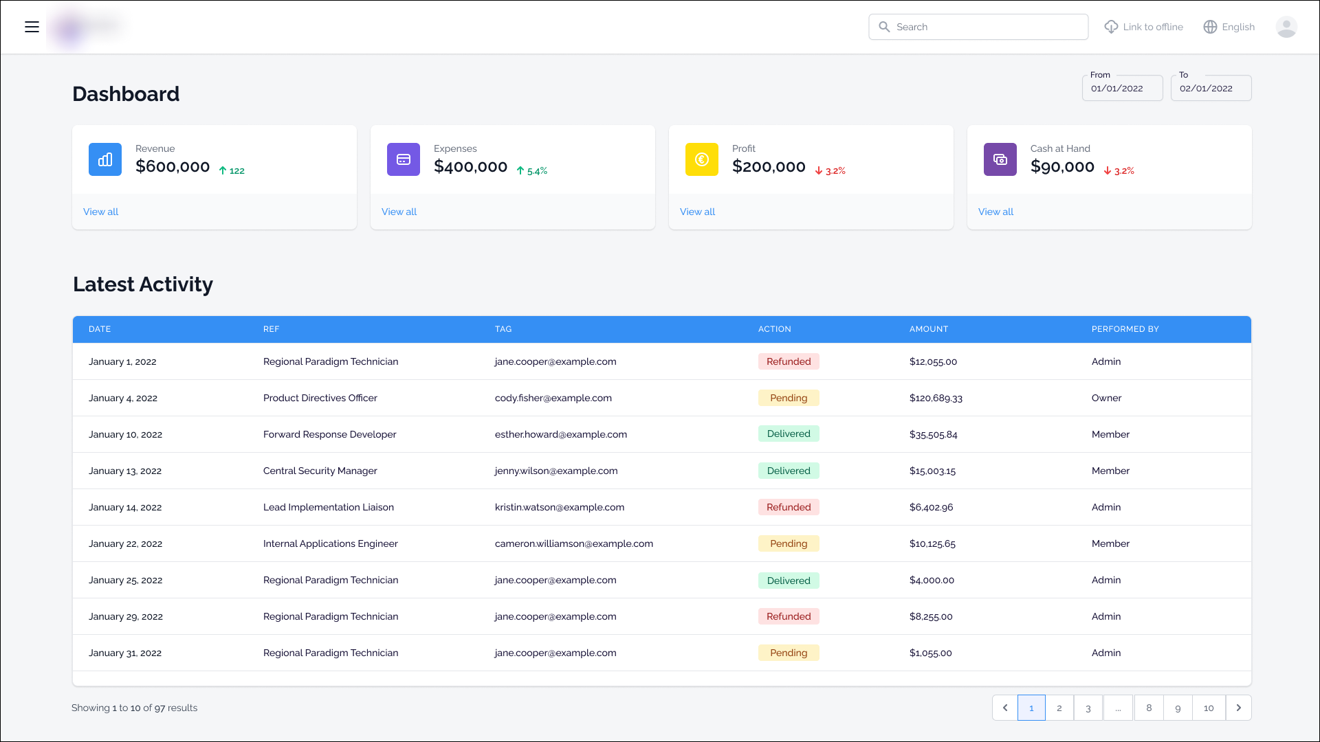
The specific elements that the client liked were the four summary boxes from Dashboard Redesign No. 1 and the blue table header from Dashboard Redesign No. 2. We took those elements and created the new Dashboard.
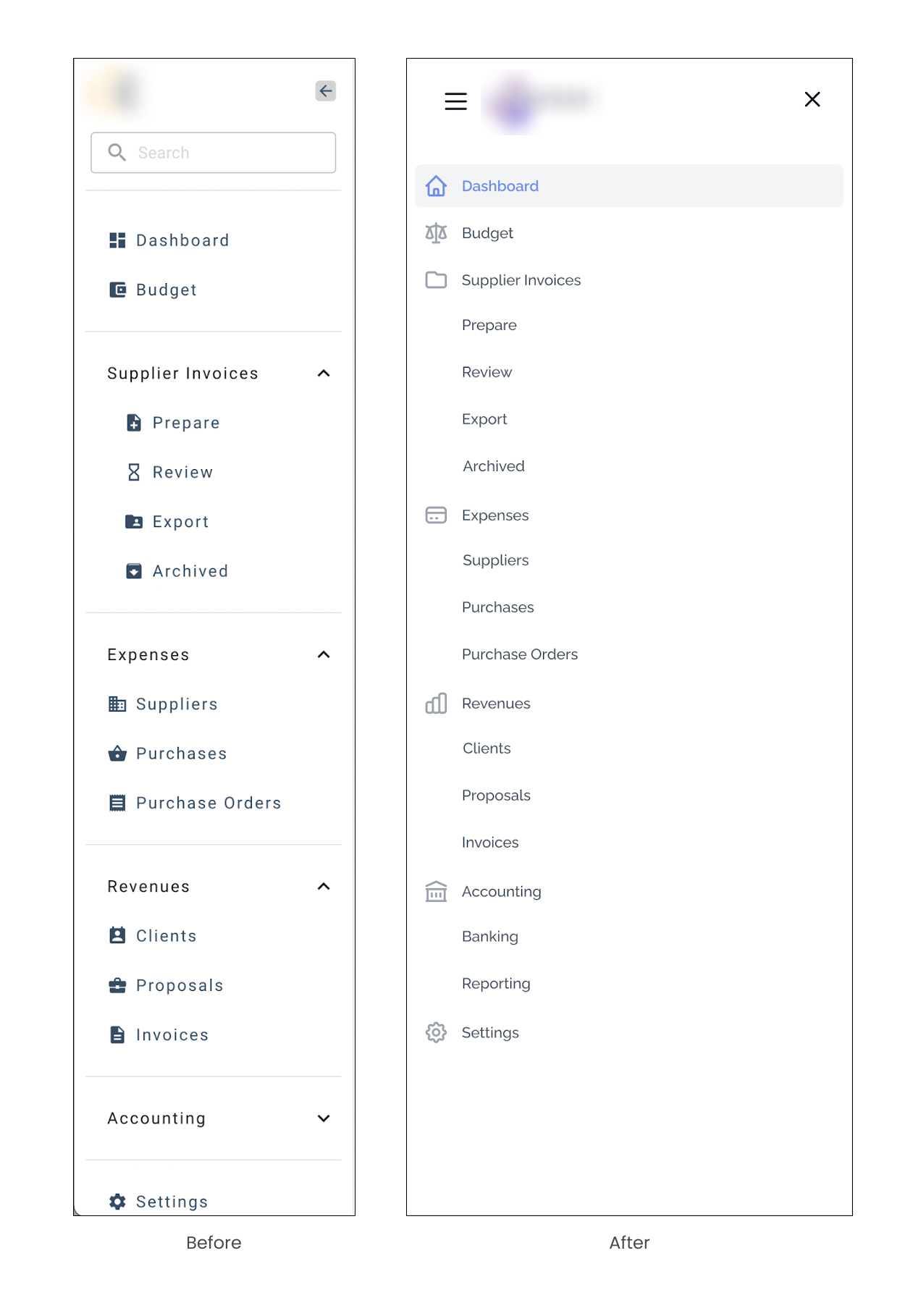
After narrowing down our design direction, we divided the remaining screens within the route between each of us. I focused on the navigation bar, vertical side menu, main budget grid, and all the overlays within this route. I began by conducting a usability test on the existing navigation bar and vertical side menu to understand the pain points and areas for improvement. I found that the navigation bar was cluttered and not intuitive, while the vertical side menu was not discoverable and not easy to navigate.
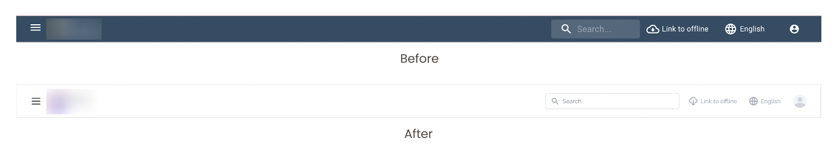
During the redesign of the vertical side menu, I noticed that the original design only included icons for two out of seven parent menu items. However, all submenus had icons. This inconsistency in icon usage could potentially cause confusion for users. To improve the user experience, I made the decision to include icons for all parent menu items, while removing icons for the submenus. This helped to create a cleaner and more consistent look for the side menu.
Additionally, I made changes to the iconography used to indicate the menu's state. Initially, I removed the hamburger icon that appeared when the menu was expanded and replaced it with an "x" icon to indicate that the user could exit out of the menu. However, after receiving feedback from my team members, I re-added the hamburger icon to provide clear visual cues to the user that they were interacting with the side menu. This change helped to improve the usability and overall user experience of the menu.
The budget grid is the heart of the application, providing the user with a comprehensive overview of the project's financials. However, the original design was lacking in functionality and organization, creating confusion for users. My goal as a designer was to improve the user experience by decluttering the screen and creating clear distinctions between the various elements.
During the initial design phase, I focused on aligning the title, tabs, and exit button with each other, and creating a visual separation from the grid itself. To emphasize the importance of the various totals, I positioned them in their own section, right below the tabs, rather than in a pill shape. Additionally, I moved elements related to the grid, such as redo/undo, search line, go to, maximize and minimize, right above the grid, to minimize the number of buttons on the screen. The only buttons that were kept in their traditional format were the Edit Quote and Summary.
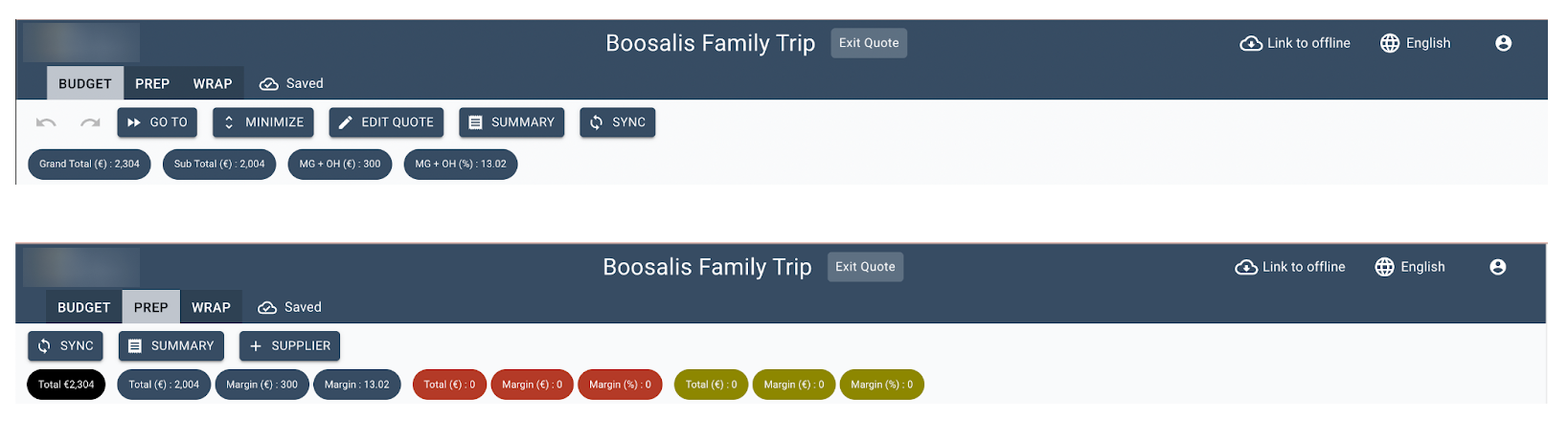

After presenting the design to the client, I received feedback that the heading was taking up too much real estate. As a result, I removed the logo from the navigation bar and pushed everything except for the exit button to the top. I aligned the three buttons (Edit Quote, Summary, and Exit Budget) on the same line, and differentiated the Exit Budget by reversing the colors of the other two buttons. To further improve the organization and clarity of the screen, I grouped and color-coded the different types of totals at the top.

The redesign of the overlays in the route was a crucial step in improving the user experience. The original design had several issues, such as the incorrect use of primary colors within buttons and an illogical order of buttons. To address these issues, I aimed to ensure consistency in heading size, spacing, and buttons across all overlays. Additionally, I wanted to make the user's journey through the route as clear and intuitive as possible.
To achieve this, I focused on using the primary color for the CTA (call-to-action) button that would help the user progress through the route. This was a key change as it would guide the user's attention towards the correct button to click, rather than causing confusion. Additionally, I reorganized the buttons in a logical order to reduce user confusion.
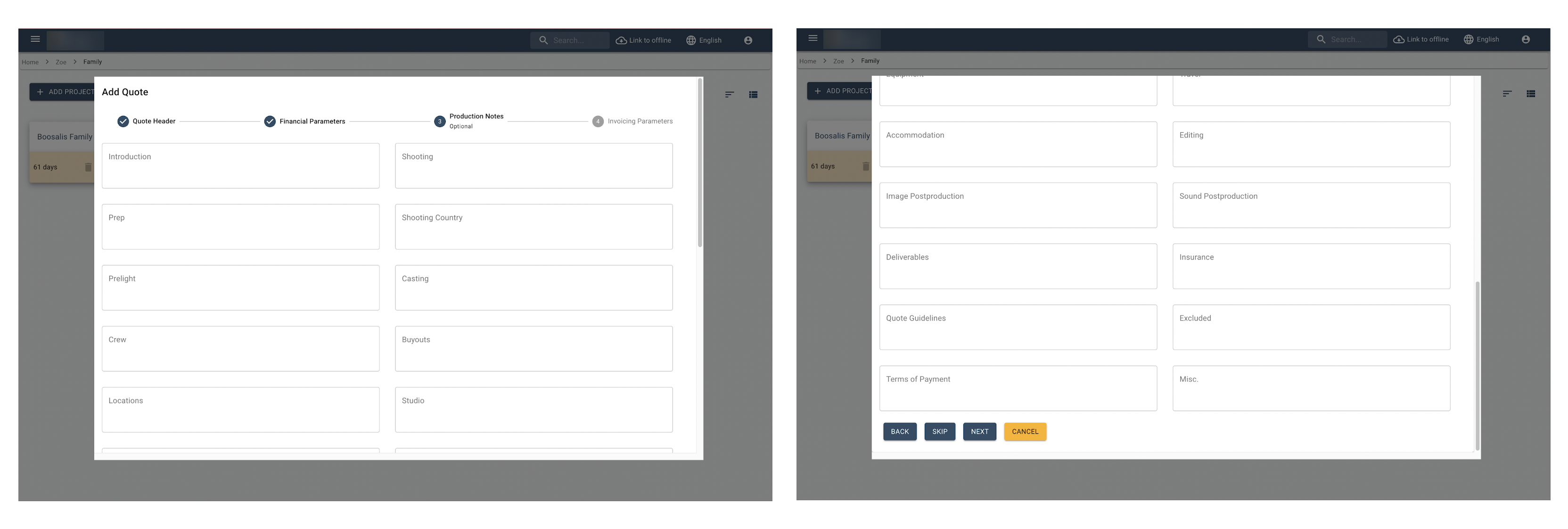
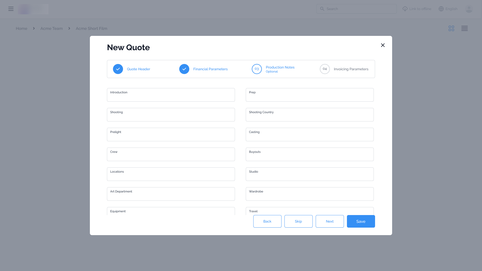
Another aspect of the redesign was addressing the overflow of text. To solve this, I fixed the CTAs to the bottom of the page, which ensured that they were always visible to the user. This helped in creating a seamless journey for the user as they would not have to scroll through the overlay to find the next step. Overall, these changes helped to improve the overall usability and clarity of the overlays, making the journey through the route more intuitive for the user.
To close out the project, we presented the redesigned screens to the client, highlighting the improvements and changes made through a series of before and after comparisons. This helped the client understand the significance of the changes and how it improved the overall user experience. In addition to the visual redesign, we also provided a comprehensive style guide that outlined the new visual design language for the app. This guide included specific details on the use of colors, typography, icons, and pre-designed UI components for easy implementation in future updates or additions to the app. This was a crucial step in ensuring that the client had all the necessary tools to maintain and continue the new design aesthetic throughout the app, maintaining a cohesive and visually pleasing user experience for their customers. We also made sure to have a thorough handover process to ensure smooth transition of the project to the client's team.
Upon the successful completion of the project, we presented the client with a fully redesigned red route that seamlessly aligned with the new aesthetic and brand attributes. As the Project Manager and Designer on this project, I had the opportunity to hone my skills in clear communication, project management, and team coordination. I was able to efficiently manage the team's time and resources by setting clear goals, deadlines, and assigning tasks to each team member, allowing us to accomplish a significant amount of work within the given time frame. This project not only resulted in a positive outcome for the client, but it also served as a valuable learning experience for me in terms of project management and design.